
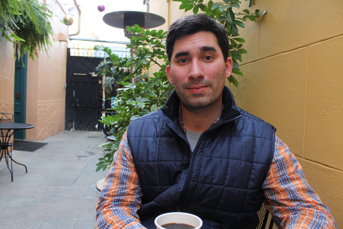
Posted by Erin Carlo, GD Public Relations Manager and Fiction Reader for 5.1 Gandy Dancers past and present are thrilled to announce the debut of…
Comments closedTag: Gandy Dancer Issue 4.2
Posted by Holly Gilbert, fiction reader for issue 4.2 In Managing Editors Courtney and Christie’s introduction to issue 4.2 of Gandy Dancer, they contemplate all…
Comments closedPosted by Alexandra Ciarcia, fiction reader for issue 4.2

[PANK] is an online and print literary magazine, with a mission statement that reads, “[PANK] fosters access to emerging and experimental poetry and prose, publishing the brightest and most promising writers for the most adventurous readers.” Their search for innovation is displayed in their selected pieces and their overall aesthetic. We were very impressed with their November & December 2015 online edition. As they state in their submission process, [PANK] asks writers to “send us something that screams.” If you take a look at such pieces as “We Sad Girls” by Lindsey Reese or “Lavatory” by Diane Williams in the November & December 2015 edition, you’ll see what I mean.
Comments closedPosted by Caitlin O’Brien, Poetry Editor for issue 4.2
As the frenzied period of submissions review winds to a close, I find myself growing a little tired of white space. White space is almost invariably inescapable when putting together a literary magazine, and perhaps even more so when dealing with poetry, yet I’ve noticed a recurring aesthetic trend of white space in many of the submissions we read. From both a literary and an aesthetic standpoint, I can’t help but find this trend in poetry to oftentimes border on excessive. This is not coming from a staunch poetry elitist who refuses to read anything written after the 1800s—I love seeing poetry as a written art form interface with the visual, as well as with the spoken, and other modes of communication.
What gives me pause when I encounter a poem that makes ample use of white space is the intentionality behind its form. In the case of some submissions, the poets submitting to Gandy have made wonderful use of white space—we’ve received calligrams in clever shapes, as well as poems that can be read in multiple ways due to the way the words and stanzas are arranged. In the case of other submissions, though, the poetry team has often used the deliberative construction of the poem’s form as a strong measure of the poem’s overall purpose. Reading a poem aloud, the white space does not always inform the flow, so much as it makes the poem seem as though the poet was possessed of a hyperactive space bar. The most common aural effect of a form that relies on white space is a pause, yet these pauses do not create a rhythm that comes across as calculated. As one reader in the poetry section said, “if we have to guess whether or not the poet meant to do something, it’s not effective.” Similarly, the primary visual effect of non-traditional spacing is to set apart important words or allow the reader to focus in on a particular image or concept, rather than jamming the space bar an arbitrary number of times in order to make a poem look modern and minimalist.
Comments closed